
The Austin Stone
UX & User Journey Optimization for an Established Multi-Campus Church.
The Challenge
The Austin Stone is a large, multi-site church that is making a lasting impact in Austin, Texas and beyond. The Austin Stone had a strong existing website but recognized the need for a strategic tune-up. Their homepage was overloaded with CTAs, their mobile experience lacked optimization, and the user journey wasn’t clearly mapped—particularly for newcomers looking to get connected. As a result, users experienced friction when navigating the site, especially on mobile devices.
Our Approach
We partnered with The Austin Stone to deliver strategic UX recommendations and implementation focused on two key areas:
1. User Journey Optimization
We mapped out the existing user flow to identify where users—especially first-time visitors—were getting stuck or overwhelmed. We uncovered that the current site didn’t fully serve newcomers and lacked a clear next step for getting connected.
Our Solution:
- Defined and simplified the primary paths for guests and members
- Identified key friction points and drop-offs
- Provided actionable suggestions to streamline engagement
2. UX Design Enhancements
A cluttered homepage and lack of visual hierarchy were causing confusion. On mobile, too much screen real estate was dedicated to content that wasn’t immediately actionable.
Our Solution:
- Streamlined navigation and reorganized homepage CTAs
- Prioritized mobile-friendly layouts and filtering features
- Highlighted core calls to action using clean, minimalist design
"We grew comfortable with our church's website and assumed it was as good as it could be. But Sunday Best brought a fresh perspective for our church. They were able to identify improvements quickly and clearly explain the 'why' behind each suggestion. Their insight and clarity mark them as true experts in the field." - Ruben Gonzalez, The Austin Stone
The Results
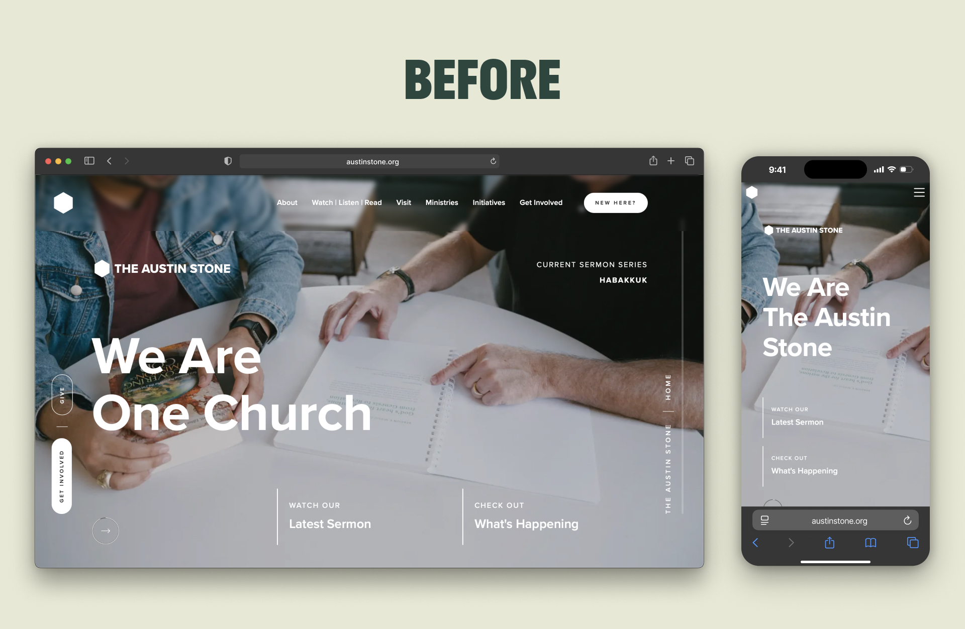
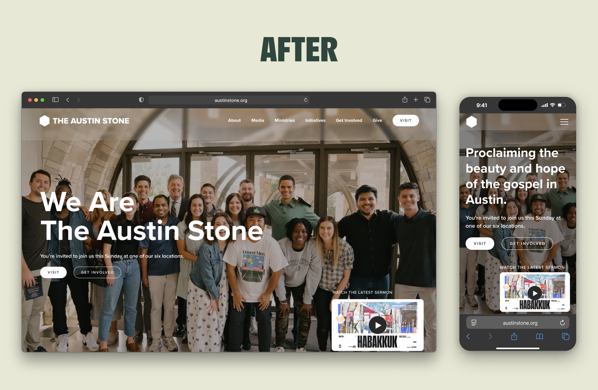
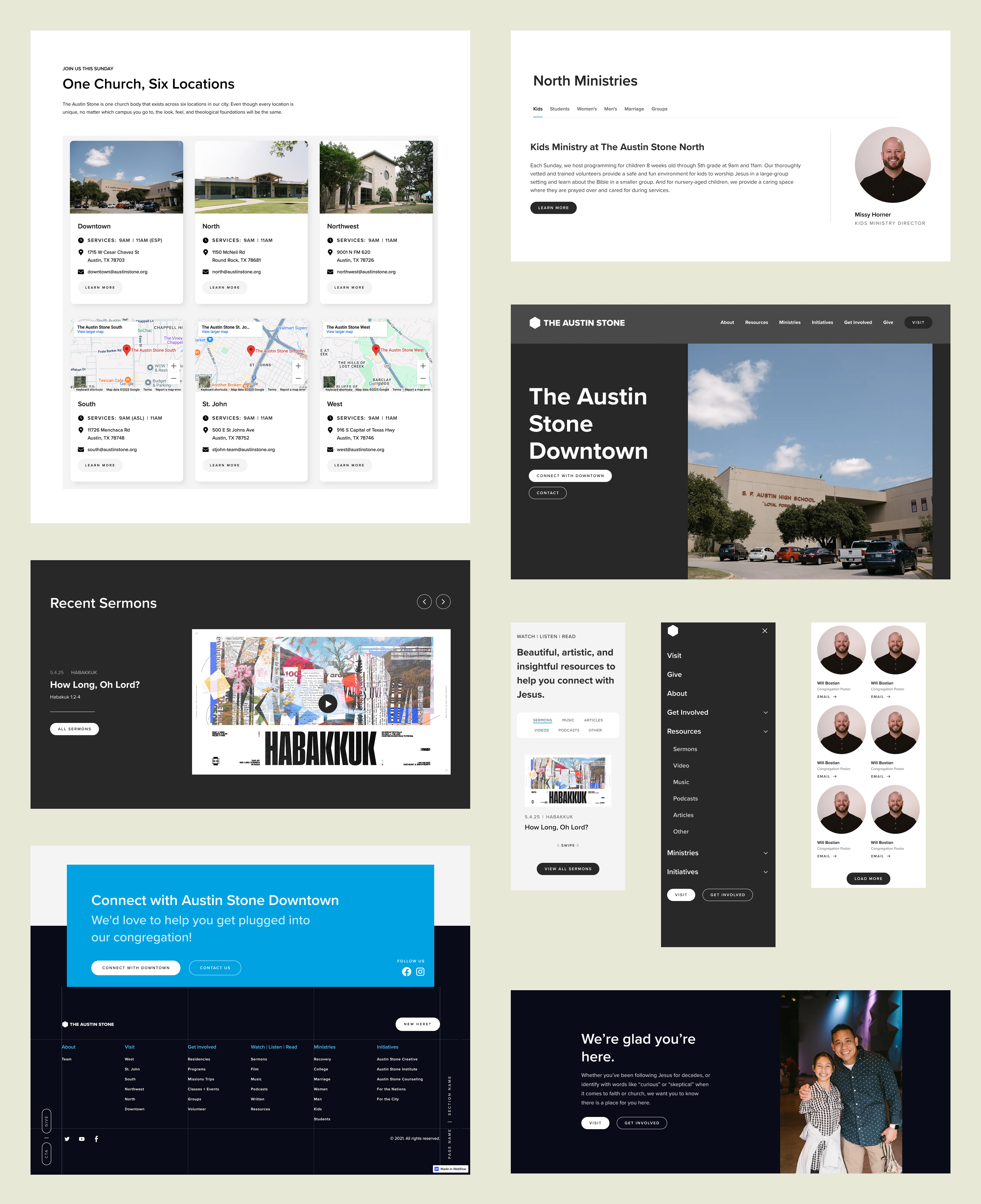
A revamped Homepage
The previous homepage was cluttered with too many buttons that negatively impacted the user experience of the page. It also had sections that were clunky and required a lot of scrolling to get through. We removed buttons on the hero section and adjusted a few elements to reduce clutter and put more focus on the main CTA that is most helpful for visitors. We also simplified the navigation bar and redesigned a variety of components on the homepage to improve the user experience.
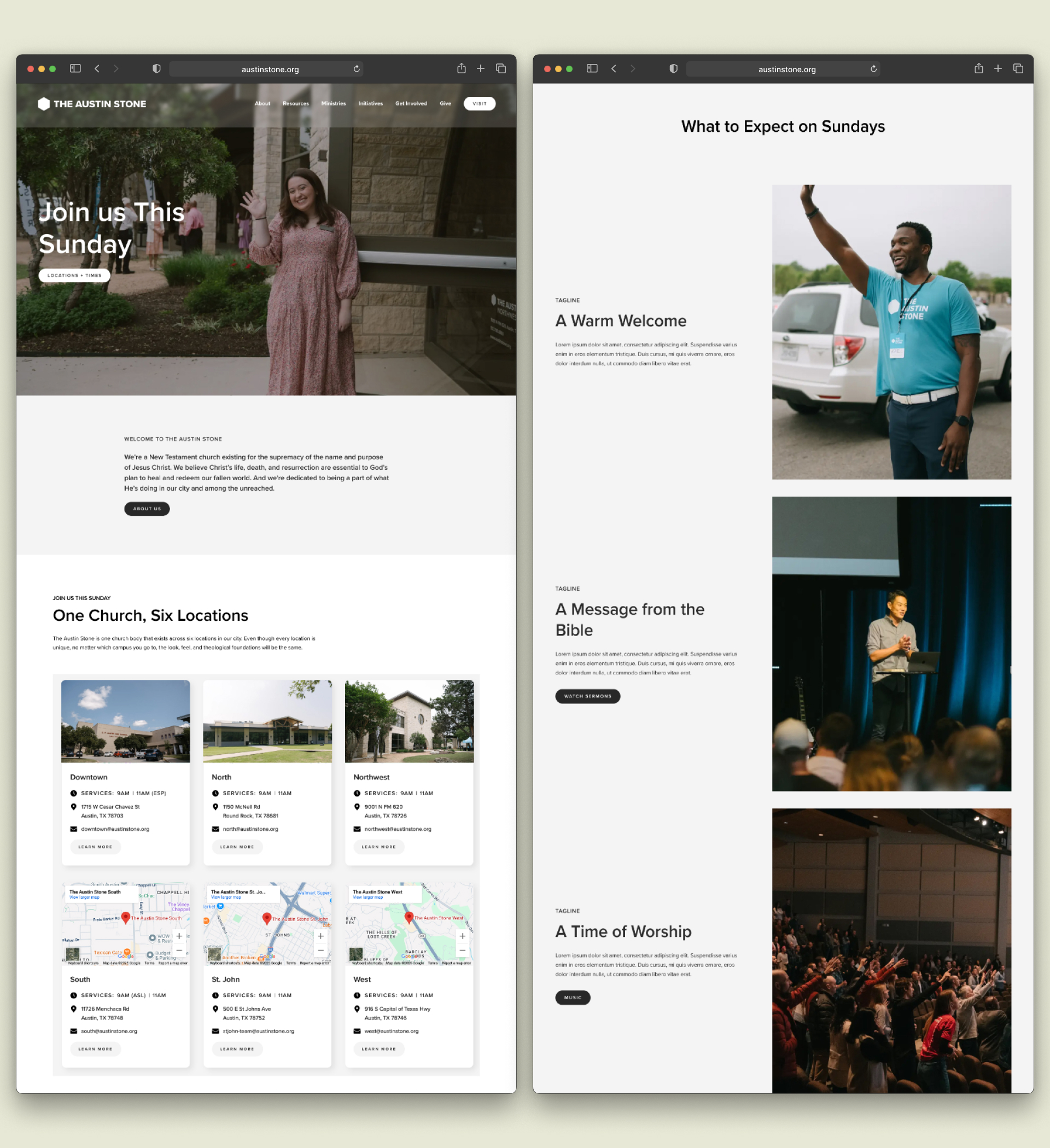
A New Visit Page
The previous site was missing a go-to page for visitors to learn more what it looks like to visit The Austin Stone for the first time. This was forcing visitors to spend extra time and effort to find this information for themselves. We created a new Visit Page that includes all the vital information a visitor might need to learn before they're willing to visit on Sunday. This new page is the main CTA of the site, making it clear what a visitor's next step looks like.
Misc Site-Wide Changes
Throughout the website we adjusted, redesigned, and removed elements to optimize the user journey and make it easier than ever for someone to get connected at The Austin Stone. Although each of these changes are minor on their own, collectively they make a big impact on the usability of the website.
The Impact
The end result was a strategic set of UX upgrades that will help The Austin Stone:
- Guide guests through a frictionless journey from visit to engagement
- Empower their community to navigate the site with ease
- Ensure their current site stays effective and relevant for the next five years


Are you ready?
