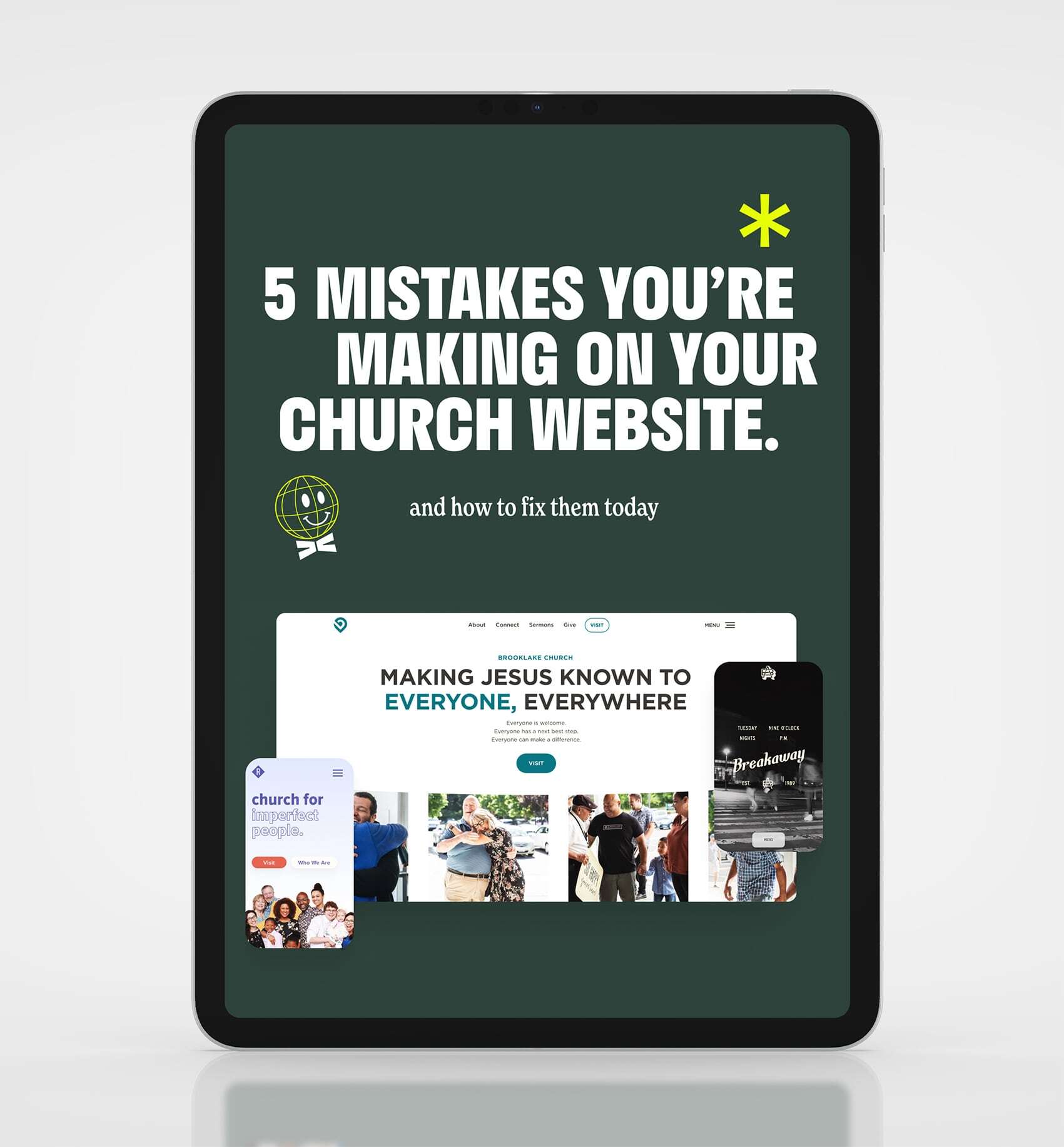
Your Church Website is the New Front Door
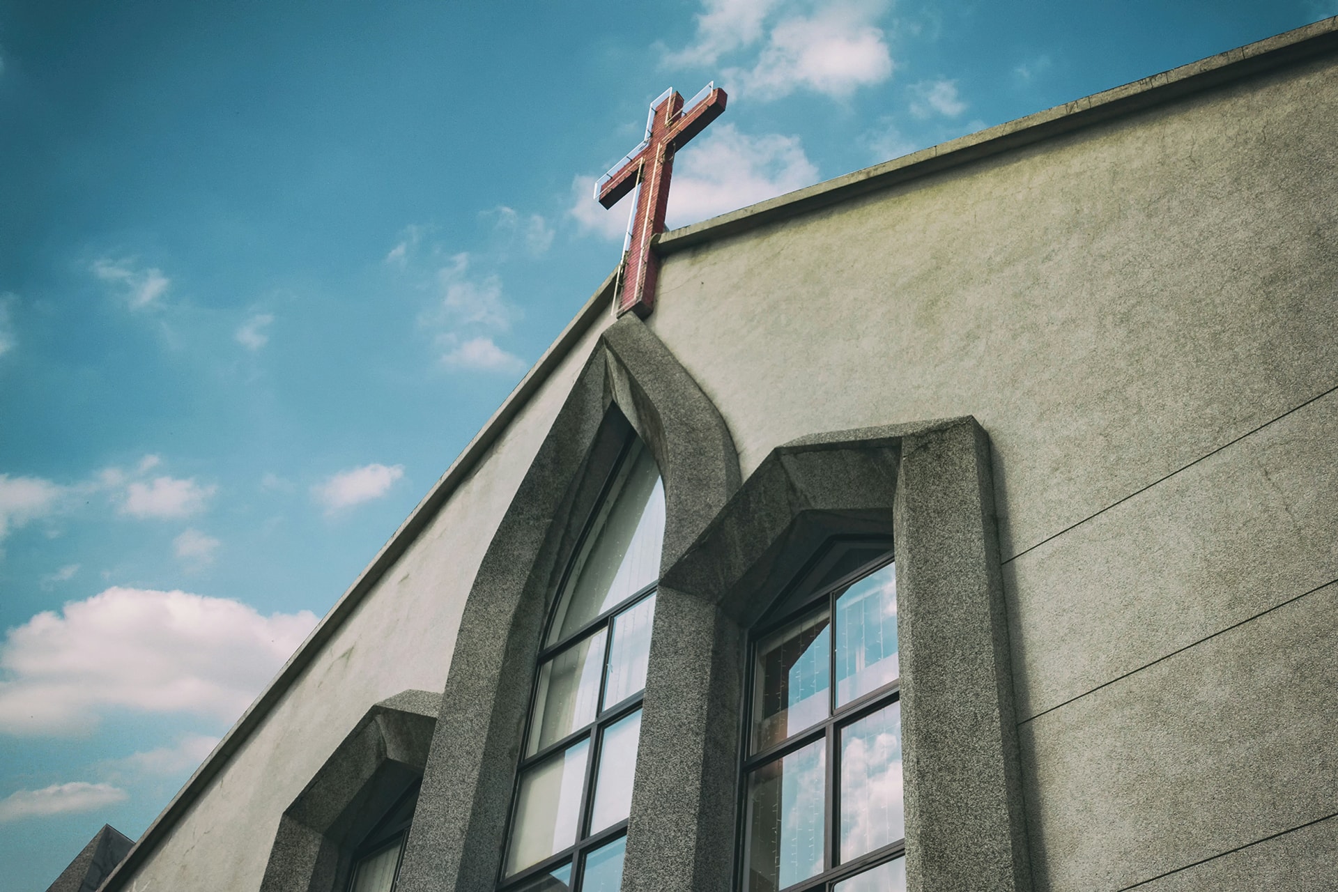
Most people visit your church website before they ever show up on Sunday. In this interview, Jake talks about what makes a church website effective at welcoming new people.
Your church website isn't just an online brochure anymore. It's the new front door to your church. Before most people walk through your doors on a Sunday morning, they've already visited your website. They're forming impressions, asking questions and deciding whether your church feels like a place they'd want to visit.
In this interview, Josh Gordon, Senior Editor of TheLeadPastor.com, sits down with Jake from Sunday Best to talk about how to build church websites that help more people take the step of visiting.
Key takeaways from the interview
Here are the main points from the conversation.
An effective website is clear and hospitable
An effective church website isn't about flashy graphics or the latest design trends. It's about clarity and hospitality. Your website should make it obvious who you are, what to expect on a Sunday, and how someone can take their next step. Think of it as rolling out the welcome mat before a guest ever arrives.
The best church websites make it easy for a first-time guest to find service times, get a feel for the church's culture, and feel invited, all within a few seconds of landing on the page. If your homepage doesn't do that, you're probably losing guests before they ever show up.
Insider language hurts your website
One of the most common mistakes churches make is using insider language that only members understand. Phrases like "join us for fellowship" or "Wednesday night discipleship" can feel confusing, or even exclusive, to someone who's never been to church.
The fix is simple: write your website copy as if you're talking to someone who has never set foot in a church. Use plain, welcoming language anyone can understand. Your website should feel like a friendly conversation, not a church bulletin.
Design for guests, not just members
A lot of church websites are designed with current members in mind: sermon archives front and center, event calendars taking over the homepage, and navigation menus packed with ministry pages. But the people who need your website most are the ones who haven't visited yet.
Put the guest experience first. Make your Plan a Visit or I'm New page one of the most prominent things on your site. Use real photos of real people from your church, and show what a Sunday morning actually looks like. When guests can picture themselves at your church, they're much more likely to show up. We dig into this more in Who Is Your Church Website For?
Upgrading your website doesn't have to be overwhelming
A redesign goes a lot smoother when you start with strategy: define your goals, organize your content with a sitemap, and build wireframes before jumping into design. That step-by-step approach keeps the website focused on both your church and your guests.
If you're curious what that looks like in practice, we've laid out our full process, from strategy to launch and ongoing support.
The right tools remove friction
The interview also covers tools that make things like online giving and event registration easier for your church and your guests. When those tools are built into your website well, they remove the small barriers that keep people from taking their next step, whether that's giving, signing up for an event or planning their first visit.
Your website is one of your best outreach tools
Your church website works every day of the week, reaching people in your community who are looking for a church home. When it's done well, it creates a welcoming first impression that leads to more people walking through your doors on Sunday.
If your church website isn't doing that job, it might be time for a refresh. Get a free quote from our team and let's talk about making your website as welcoming as your Sunday morning.
Related Resources
Can AI Build Your Church Website? Why You Still Need an Expert
AEO for Churches: How to Get Found in the Age of AI Search

How to Make the Case for a New Church Website to Your Leadership

How to Choose a Church Website Agency
Local SEO for Churches: How to Show Up When People Search
Church App vs Church Website: Do You Need Both?
Church Website Accessibility: A Practical Guide for Welcoming Everyone Online
How Much Does a Church Website Cost? A Transparent Pricing Guide
WordPress vs Webflow: Why We Build Every Church Website on Webflow

Is Webflow Secure? Why Churches Can Trust Webflow for Their Website

The Ultimate Church Photography Guide
Your Church Website is the New Front Door

5 Advanced Webflow Features Large Churches Can Leverage
Visiting a Church for the First Time is hard
5 Things Every Church Website Should Include
Multi-Campus Church Websites

The Most Important Page on your Church Website
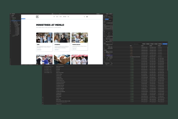
How to Edit Your Church Website in Webflow
Best Church Website Builders in 2025: A Complete Guide
SEO: A Guide for Churches

How to Write Great Website Copy

Custom vs. Template Church Websites
What is Webflow? The Best Platform for Church Websites
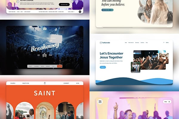
The Best Church Websites of 2024

Who is Your Church Website For?


Are you ready?
