Church Website Accessibility: A Practical Guide for Welcoming Everyone Online
Is your church website usable for everyone, including people with disabilities? Here's what accessibility means, what the law does and doesn't require of churches, and practical steps to make your site more welcoming.
Your church works hard to welcome everyone who walks through the doors. It's worth asking whether your website does the same.
For people with visual, hearing, motor or cognitive disabilities, a lot of church websites are hard or impossible to use. Missing image descriptions, low-contrast text, sermon videos without captions and menus that only work with a mouse all shut people out. If someone can't read your service times or watch last week's sermon because of how the site was built, that's worth fixing.
What web accessibility means
Web accessibility means building a site so people with disabilities can read it, navigate it and use it, including people who rely on screen readers, keyboards, captions or zoom.
The standard most people use is the Web Content Accessibility Guidelines (WCAG), published by the W3C. The current version is WCAG 2.2. It boils down to four ideas: people need to be able to perceive your content, operate your site, understand it, and use it with the devices and assistive tools they already have.
Why it matters for churches
It's how you welcome people online
Your church probably already takes extra steps on Sunday morning so people feel welcome. Maybe it's greeters at the door, a ramp at the entrance, accessible seating or large-print bulletins. Nobody asks you to do those things. You do them because you want everyone to know there's room for them.
Website accessibility is that same extra step, online. It means people of all kinds, whether they're blind, deaf, older, or getting around with a keyboard instead of a mouse, can find your service times, watch a sermon and plan a visit just like anyone else. When your website takes that step, it says the same thing your church says on Sunday: you're welcome here.
What the law does and doesn't require
You'll see a lot of agencies use the ADA to pressure churches into accessibility work, so it's worth being accurate. Title III of the Americans with Disabilities Act, which covers businesses open to the public, does not apply to religious organizations or places of worship. In most cases, the ADA doesn't require your church's website to meet a specific accessibility standard.
That's not the whole picture. State laws can differ, and things like renting your building to an outside organization can change what applies. We're not lawyers, so if you have a specific legal question, ask one. But for most churches, accessibility is a ministry decision, not a compliance one. We think that's the better reason anyway.
It helps everyone
Accessible sites are easier for everyone to use, including older members squinting at a phone, someone watching a sermon on mute, or a guest on a slow connection. Many of the same practices, like clear headings, descriptive links and alt text, also help search engines and AI tools understand your site.
How we approached accessibility with Northshore Church
For Northshore Church, accessibility is personal.
Shortly after their new site launched, someone on their staff reached out. They loved the new website, and they had one question: had it been through an accessibility checker? After years working in the tech industry, they saw accessible design as essential, not optional. It was also something close to their heart.
We aim to meet accessibility standards on every site we build, so when they asked, we triple-checked. We reviewed the site against WCAG 2.2 and found a couple of things we'd missed. The biggest was a "skip to content" link and main landmark, which let keyboard and screen reader users jump past the navigation straight to the page content. We fixed everything in Webflow and sent their team a one-page, plain-language summary of what we changed and why.
Now their site meets WCAG accessibility standards. More importantly, someone using a screen reader can find a service time and plan their first Sunday as easily as anyone else. We're grateful they asked.
Common accessibility issues on church websites
Missing image alt text
Every meaningful image needs alt text, a short description that screen readers announce. Photos of your building, staff and Sunday services should all have it. Purely decorative images can use empty alt text so screen readers skip them.
Low color contrast
Light gray text on a white background looks clean, but it's hard to read for anyone with low vision, and for everyone outside on a sunny day. WCAG asks for a contrast ratio of at least 4.5:1 for normal text and 3:1 for large text. A free tool like WebAIM's Contrast Checker will tell you if you pass.
No captions on videos
Sermon videos and announcements need captions for people who are deaf or hard of hearing, and they help anyone watching with the sound off. YouTube and Vimeo both create automatic captions. Take a few minutes to correct them, especially names and Scripture references.
Menus that only work with a mouse
Some people navigate with a keyboard instead of a mouse. If your dropdown menus, buttons or forms can't be reached with the Tab key, those visitors are stuck. Try it yourself: put your mouse aside and tab through your homepage.
No skip link
Keyboard and screen reader users have to move through your entire navigation on every page before they reach the content. A "skip to main content" link, usually hidden until someone presses Tab, lets them jump straight past it. It's a small fix that a lot of sites miss.
Headings used for looks
Screen reader users often jump from heading to heading to scan a page. That only works if headings are in order: one H1 per page, then H2s for sections and H3s inside them. Don't pick a heading level just because you like its size.
Vague link text
"Click here" and "learn more" don't tell a screen reader user where a link goes. "See our Sunday service times" or "read our visitor guide" does.
How to check your own site
You don't need to be a developer to start.
- Run an automated scan. Google Lighthouse (built into Chrome), WAVE or axe DevTools will flag common issues. They won't catch everything, but they're a good start.
- Use only your keyboard. Tab through your homepage and Plan a Visit page. Can you reach every link, button and form field, and can you see where you are?
- Check your colors. Run your main text and button colors through a contrast checker.
- Try a screen reader. VoiceOver is built into Macs and iPhones. NVDA is free on Windows. Even five minutes will teach you a lot.
- Review your images. Make sure every meaningful image has alt text that describes it.
How Webflow helps
Webflow is a good foundation for accessibility, which is one reason we build on it. It gives us control over the actual HTML, so we can use proper heading structure, landmarks and ARIA labels where needed. Alt text is a field on every image, and Webflow's built-in audit panel flags common issues like missing alt text before a page goes live.
The platform doesn't make a site accessible on its own, though. Design choices like color, font size and how menus behave matter just as much, which is why we think about accessibility from the first design, not as a cleanup step at the end.
Where to start
You don't have to fix everything at once. Start with alt text, color contrast and captions, since those affect the most people. Then work through keyboard navigation and headings.
If you'd like a second set of eyes, we can review your church's site and give you a plain-language list of what to fix. Reach out to our team and we'll take a look.
Related Resources
Can AI Build Your Church Website? Why You Still Need an Expert
AEO for Churches: How to Get Found in the Age of AI Search

How to Make the Case for a New Church Website to Your Leadership

How to Choose a Church Website Agency
Local SEO for Churches: How to Show Up When People Search
Church App vs Church Website: Do You Need Both?
Church Website Accessibility: A Practical Guide for Welcoming Everyone Online
How Much Does a Church Website Cost? A Transparent Pricing Guide
WordPress vs Webflow: Why We Build Every Church Website on Webflow

Is Webflow Secure? Why Churches Can Trust Webflow for Their Website
The Ultimate Church Photography Guide
Your Church Website is the New Front Door

5 Advanced Webflow Features Large Churches Can Leverage
Visiting a Church for the First Time is hard
5 Things Every Church Website Should Include
Multi-Campus Church Websites
The Most Important Page on your Church Website
How to Edit Your Church Website in Webflow
Best Church Website Builders in 2025: A Complete Guide
SEO: A Guide for Churches

How to Write Great Website Copy

Custom vs. Template Church Websites
What is Webflow? The Best Platform for Church Websites
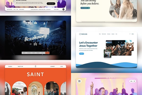
The Best Church Websites of 2024

Who is Your Church Website For?


Are you ready?
